Tuesday, September 20, 2011
 The same font style, but with different sizes and colours for headings, titles, and the body of text
So this is how the framework and appearance of a Blogger blog is made. You've probably realized that it's actually quite similar to the book-designing softwares that I talked about here a while ago. If you've written before,then it's similar to Microsoft Word or Adobe Indesign or QuarkXPress.
There's still a few things to discuss, but I'll save that for another day. If you have the time, and have a subject that interests you, then why not share it with your family or everyone? And don't worry about having to write every day either! You can write whenever you want and how many times that you want to write.
An Instalment on Blogger
I'm getting ahead with this blog because I haven't added many instalments for this month. If you read this instalment today (Sunday or Monday September 18-19), you might get confused, so this my explanation.
Whenever I viewed my Blog, I noticed that the posts (another word for instalment) were always overlapping the main window area of the blog. So I decided to do something about it. If you're reading this blog now, you'll notice that I've expanded the window area and separated the right-hand sections (My followers, blog posts) from overlapping the main window. If anyone finds this too big,then please send me an e-mail and if enough of you find it too large, I'll gladly change it.
Once I found where to do the changes, I decided to write about designing your blog on Blogger. As with much of the software that I have or have tried out, it seems for the most part to be getting easier to use (I'm having a bit of trouble with Camtasia!). It's more "user-friendly". My interpretation of this overused term is defining the expression in terms of how fast and easy the user can begin to work with the program or software.
My Standard Design
A Variation of the Design
Another Variation of the Design
The Upper Right Corner of your Blog Page
Pressing on the word "Design" gets you to the next window below.
The Basic Design Window
This allows you to add or remove the above elements to the basic the structure
The Dashboard
When you log in to Blogger, you can go to what is called the "dashboard".
That's what you see above.
I can see how many people are visiting me (Stats), and I could add advertisements to my blog in order to make some money. However, I only garner 20-40 visitors (thank you all!), and at this rate it would take 10 years to maybe have Blogger actually send me any money.
However, I enjoy what I'm doing, and I'm happy to have all of you visit.
An Enlarged Portion of the Dashboard
When you press on the word design, a sub-menu title "Template Designer" will appear.
Clicking on the term "Template Designer" will get you to the image below.
The Template Menu
I've shown you 4 different variations at the start of this post.
These basically are the "front window" of the blog.
I assume the above command window will "copyright" your material so nobody will copy it.
"The Gadget Window" allows you to add "gizmos" to your blog.
I don't think I have any, but perhaps, in another post, I'll play around with them to see what they are and how they appear on the post.
The Background Menu
This window allows you to choose the background of your blog window.
There are many choices, but you should think of keeping the background "low key". Low key simply means "not too showy", as you don;t want the background to distract from the foreground.
The Basic Design Window
This allows you to change the theme colours of the text (writing).
The writing here is green with other colours presented with the theme
The writing here is white with the other colours of the theme
A Sample Variation of Text and Background
This one is very "neutral" and maybe a bit "bland".
The command window below was used to select the grey colour.
Another Sample Variation of Text and Background
This background is from a sub-menu titled "business".
It's more interesting, but is it too busy?
Another Sample Variation of Text and Background
Another Sample Variation of Text and Background
Another question in the last few backgrounds is "is the size of the foreground too small because the background appears to be occupying too much area?"
An Enlarged Screen Capture of the Background Menu titled "Abstract"
The "Adjust Widths" sub-menu allows you to widen or narrow the
"Entire blog" and the "Right sidebar".
Below are several examples of the changes with these 2 commands.
A narrow blog area with a wider right sidebar
A wider blog with a wider right sidebar.
I didn't like the overlap and that's what initiated me to make
the overall appearance change to my Blog.
Another variation.
I like this one!
This menu is a design element.
It offers the blogger different choices of positioning text with photos.
Variation # 1
Variation # 2
I don't like this one.
The photo "disrupts" the writing.
Variation # 3
I don't like this one either for the same reason as the one above.
Also, the width is too narrow, and the background is too wide and occupies to much area.
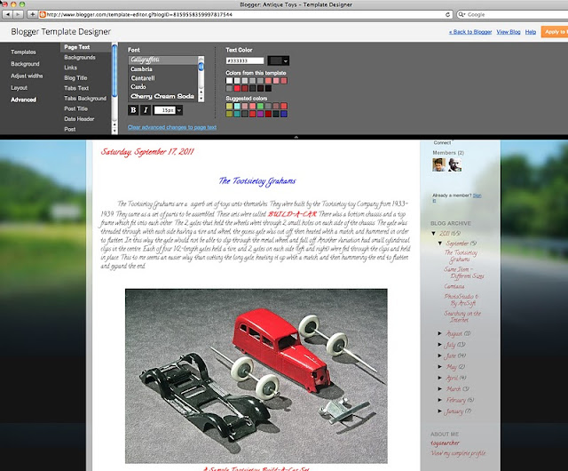
The Advanced Menu
This menu allows you to create innumerable variations of the text.
Size, colour, style all can contribute to the visual effect of your blog.
However, there are the usual "rules" to follow, but as always, you can do whatever you ant - it's your blog of course!
Some of the Rules
1. Don't have too many different font styles.
2. Don't have too many different sizes of headings
3. Don't have too many different colours, but if you do,
keep them in within the colour theme, and test out the colours first.
a. Bright colour are difficult to read.
b. Dark colours on a dark background or light colours on a light background
will merge and disappear
Nice handwriting, but how easy is it to read?
Should it be in bold?
Two different fonts.
You can change the Title of the Post
You can change the title of the blog
You can have different fonts on different parts of the page
 The same font style, but with different sizes and colours for headings, titles, and the body of text
A Close-Up of the Font Window
There's still a few things to discuss, but I'll save that for another day. If you have the time, and have a subject that interests you, then why not share it with your family or everyone? And don't worry about having to write every day either! You can write whenever you want and how many times that you want to write.
That's it for now, so wherever you are, good morning, good afternoon, or good evening.


No comments:
Post a Comment